Posts

Digital Media Portfolio
Image
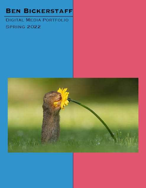
Below is the portfolio I created with the works from this year. Overall, I had a fun time creating these projects, and enjoyed the process of putting them together into one document. The portfolio was made in InDesign, and was relatively straightforward to make. This semester, I learned a lot about the different softwares, and furthered my skills in each. I enjoyed learning new things about graphic design, and hopefully I am able to use these new skills in the future.
Somewhere

Image
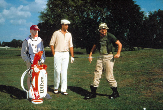
  This project required us to take images of ourselves and place them in a movie scene. I chose a scene from Caddyshack, one of my favorite movies. When working on this project, I had a really fun time placing myself within the scene. The project required a lot of masking, which was something I was familiar with. To place myself within the scene I masked myself behind the bag, using an image of myself at a caddying event this past fall. The tough part for me was matching the lighting. The image I used was relatively bright, and with my pale skin it was difficult to match with the scene. To match the grain between the images I used a film grain overlay, which allowed me to match them pretty well. Overall, I enjoyed this project a lot. It is relatively similar to some of the work I have done before. What makes my work successful was the ability to mask myself into the frame, over another character, as well as how I was able to match the lighting pretty well.

Business Cards

Image
 This project was using InDesign, which is a software I had never used before. we were tasked to create three different business cards using the different colored logos we created. I enjoyed this project. I like making things like this. one of the first things I did when using photoshop was create business cards for my brother's business, so this was very enjoyable for me. I liked InDesign's interface for making these cards. It was relatively simple to figure it all out, and was pretty similar to the other programs in the Adobe suite.  When making these cards, I wanted to give completely different styles. In my previous post about the logos, you can see that my colored logos are all using red and black, however for this project I changed it around. I found that changing the logo colors based on the card would make it look better, and give me more options on what to create. The first card was simple. I took the black and red logo, and made a simple black and white card. Somethin

Tag Brush

Image
This project was fairly simple. It was to take our logo, and create a brush that we can used, basically like a spray paint tag you would see from a street artist. I really enjoyed this project as well. Though it was fairly simple, it was cool to make my own brush. For this, I took my logo, and added a spray paint overlay around it, then added some texture over the logo itself, which allowed it to look like a tag.  I thought that the tag was cool. I have had to use similar things in the past, like a watermark, but I thought that this was a more fun way to do it. It was really fun to change the colors around and do crazy things with it. What makes this successful is that it clearly displays my logo, while still having the spray paint effect, making it look like a tag brush.

Logo

Image
For this assignment, we had to use illustrator to create a logo for ourselves. This is something that I have been toying with for a while, as in today's marketing landscape, having your own personal brand is becoming increasingly important. This assignment was really fun. I love making logos for different things, or updating logos of current things like sports teams. For this particular piece, we had to make three colored versions of our logo.  I started the project with a black and white logo, which utilized a B for my name, and three feathers coming off it which I took inspiration from the Goodyear logo, which is the foot with wings. The wings were also used because I play lacrosse, and the sport was create by Native Americans, and eagle feathers are important in their culture. Originally, I had an original lacrosse stick underneath the B, however when we zoomed out on it, you couldn't make out the stick, so I decided against it. When it came to choosing the colors for each v

Self Portrait Poster

Image
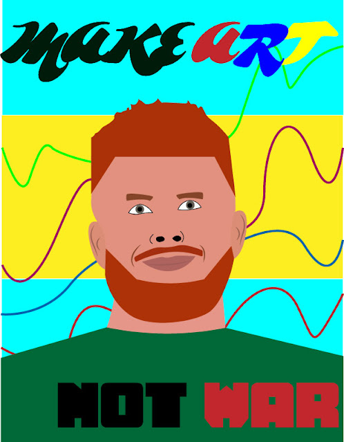
  For this project, we were utilizing Adobe Illustrator to create a self-portrait propaganda poster. I have used Illustrator in the past to create other work, however it is still a platform that I struggle with at times. this project however, was enjoyable. I found it fun to take an image of myself and try to recreate it as a drawing.  When it came to choosing a propaganda statement, I chose to go with "Make Art, Not War." I thought that with all that is going on in the world, especially in Ukraine, that the slogan was appropriate. For me, I feel that the world needs more art and beauty, opposed to war and anger, whether that be actual war, or other things like politics, and disagreements. Like I stated previously, I have had some previous experience in the software, so how it operated wasn't foreign to me, so it was relatively easy to figure out what I wanted to do, and how I wanted to do it. The issues came with the execution, whether it be getting the right tones, or m

Photoshop homework 2

Image
  1. I think this would be difficult to photoshop myself into. With all of the colors, and light trails, I would need to properly light myself to make it look like I am there. Along with properly exposing my photo, having to light myself with the light trails would be difficult. 2. This image made me laugh and remember the funny memes from when Obama was in office. It reminded me of the funny images we got to see all the time, and made me think about the possibility of photoshopping myself into an image with them. 3. This image made me laugh. I thought this was a funny way to fix his question. It also reminded me of my fear of losing my hair, and not wanting people to see it. Overall this one made me laugh a lot. 4. I would like to recreate this illusion. This is because I have done food photography before, and had to create my own make-shift studio, like this one. I enjoyed the process of creating the setting for the food to be displayed on, it takes a lot of creativity and patience t