Self Portrait Poster
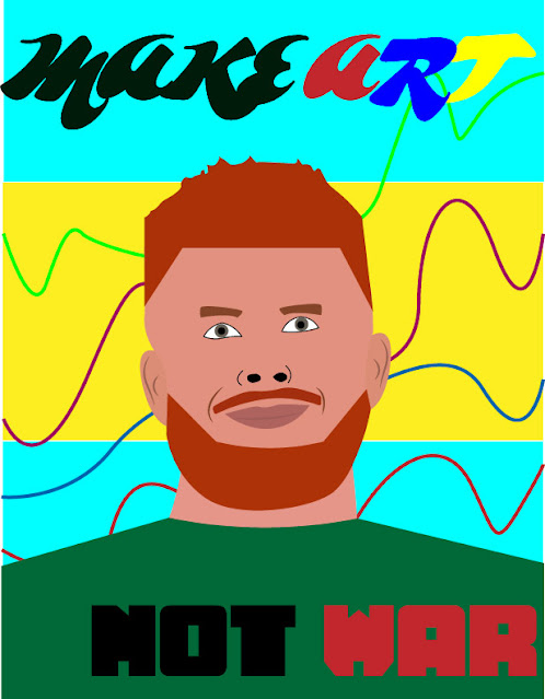
For this project, we were utilizing Adobe Illustrator to create a self-portrait propaganda poster. I have used Illustrator in the past to create other work, however it is still a platform that I struggle with at times. this project however, was enjoyable. I found it fun to take an image of myself and try to recreate it as a drawing.
When it came to choosing a propaganda statement, I chose to go with "Make Art, Not War." I thought that with all that is going on in the world, especially in Ukraine, that the slogan was appropriate. For me, I feel that the world needs more art and beauty, opposed to war and anger, whether that be actual war, or other things like politics, and disagreements.
Like I stated previously, I have had some previous experience in the software, so how it operated wasn't foreign to me, so it was relatively easy to figure out what I wanted to do, and how I wanted to do it. The issues came with the execution, whether it be getting the right tones, or making the portrait look how I wanted it (basically the execution).
For most of the project I used the pen tool.When tracing my face from my reference image, I used the tool, and also used it on the different parts of my face like my nose, eyes and mouth. One of the things that I did a little different from what we learned was I used the curvature tool to make my curved parts. I would use the pen tool and make a straight line, and curve it with the curvature tool. For me that is just a personal preference, and have been doing it for a while when working in the software.
For my script, I wanted to use a creative looking font for the "Make Art" part. I thought that when talking about art, it makes sense to use a creative font. For the "Make War" part, I thought that using a serious color and font made the most sense, because it is a serious subject. For the background, I wanted to use colors similar to the Ukraine flag, which is blue and yellow. Though it isn't the exact flag, I thought that having those colors would be a nice way to express the thoughts I had about that war while making the piece.
Overall, I liked this project. What makes mine successful is the use of the pen tool, and utilizing the eye dropper tool to match the colors in my reference image closely, even though I used a green shirt instead of the suit I was wearing.


Comments
Post a Comment