BW to Color Project
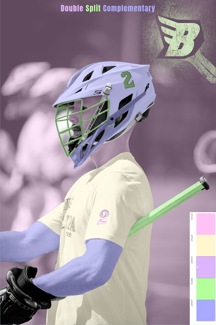
This assignment was to make a piece of art using photoshop, that required us to take a black and white image and make it into a colored image, using solid color overlays, and masking. For my pieces, I chose to use analogous, triad, and double split complementary color rules.
I enjoyed this project. I have been using photoshop for a long time, so it was nice to do a project using the software. I found it fun to use different colors and create something different and fun. I found it particularly fun to play around with the colors of the helmet in my photo. Since the photo I used was of me playing lacrosse, it allowed me to use fun colors to basically design new styles of helmets, which is something I used to do as a kid online, before I would buy a new one.
When designing this piece, I wanted to utilize colors that I liked. I picked three different styles, then played with the tool on color.adobe.com. I picked random colors on the analogous one, but tried to choose more pastel/faded colors for the other two. For the double split complementary, I managed to find one that provided one of my favorite color combos, that remind me of Buzz Lightyear, with the green and purple colors.
When designing, I used a handful of tools. I obviously used the solid color overlay, and adjusted the opacity of each layer. To mask, and make selections, I mainly used the quick selection tool, then went into the layer mask and used a brush to clean up the edges. This was kind of annoying. My least favorite part of using photoshop is long masking processes, and since my photo had a lacrosse helmet in it with small parts, it made the process take a while. Usually for masking I use photoshop’s new feature called select subject, where photoshop automatically selects the subject for you, which I used to outline myself, and change the color of the background.
Overall, I enjoyed being in photoshop once again. Though this style of art is a far departure from what I traditionally do, I had fun using different colors to create a piece of art. It allowed me to be creative with choosing what color to place where, which was less stressful than past projects. It was fun to see what my image looked like before, and the different ways that it ended up looking in the end.
What made my piece successful was how I masked out the different areas. I think that I was able to do a pretty good job masking the areas accurately, which allowed me to create pieces of art that looked well done.
 |
| Origional Image |
 |
| Black and White Image |


Overall, I think you choose color palettes that were visually pleasing and intriguing. The different layers of colors made me drawn to different aspects of your image depending on where you choose to put the color. Good Job!
ReplyDeleteThis project turned out really great! I like the colors you chose it really brought out the image! Looking at your other photoshop projects you seem to be really good at it! Keep it up!
ReplyDelete